Design Process
Throughout the process, I advocate for users. While I strive to utilize industry best practices and accommodate typical user behaviors in all of my work, the only surefire way to judge the usability of an interface is to test it with users. Depending on the project’s scope and timeline, user testing may be employed to....
Investigate the usability of an existing product and/or competitors to identify pain points and opportunities.
Determine the most intuitive architecture and vet innovative ideas through card sorting and early wireframe exploration.
Test key flows to make sure we have a usable blueprint before applying visual design.
Build consensus among stakeholders. It’s hard to deny the evidence of seeing users struggle with or breeze through designs.
Test finished builds to catch bugs and points of friction so we can launch with an optimal first impression.
User Testing

Notes from testing key user tasks for JOANN.

Scroll indicator UI options tested for ARC apps.

Card Sorting results for JOANN.

Test Script draft for ARC App testing.
When a new project is kicked off, the journey into the world of that company and audience begins. I ask all the basics—scope, demographics, intent, technical limitations, existing flow—and anything that I initially think might effect the project going forward. This helps fuel research and brainstorming for all involved teams.
Questions

Example questions for a new health project.
I document the state of the current product by mapping the flows with screenshots in a digital whiteboard, noting any issues and delightful moments that already exist. This helps me truly understand all the features and states that need to be accounted for and creates a record that can easily be referred back to throughout the project. Of course, this also inevitably uncovers more questions that will be put forth to the client.
Existing Product Map

Mapping Famous Footwear’s app.
I then document the flows and comb the reviews of other apps in the field to see what this user base expects and what essential aspects may be missing from the client’s product. A competitor grid distills what features were found and is quicker for clients to understand at a glance. If the scope and product type allow, this is a good place to conduct user research to see how our audience responds to existing competitors as compared to the client’s product.
Competitor Research

Full competitor feature comparison grid with notes.

Quick View of feature comparison grid.
Humans think in nouns, not screen types, which is why I practice Object-Oriented UX. Before diving into layout, I figure out the main modules of the system by mapping out the objects users are there to interact with. This helps us understand the relationships between them and sketch out a contextually connected system that is intuitive to navigate before ever laying out a screen. It brings functionality questions to light early in the process and gives me a robust feature set to wireframe.
OOUX

Example OOUX exercise.

Meaning of sticky notes in OOUX.
Architecture Experiments
Grouping objects and features from the previous exercise into different tab configurations helps to determine what architecture seems the most intuitive. This is basically an internal card sorting exercise. The most promising of these become wireframe sketches. If the scope allows, ideally we would get user feedback at this stage to see how the information architecture (IA) aligns with user mental models.

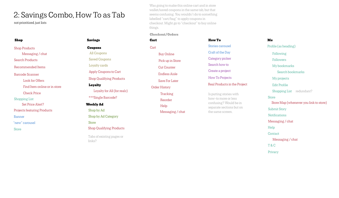

Two or three IA experiments become the jumping off point for wireframes. These show a low-fi outline of how the system's objects would relate within each configuration. Once reviewed internally and presented to the client, the best aspects and any feedback are incorporated into a single version that is then expanded to include more states as necessary. The resulting document is meant to generate discussion so we can identify any gaps in our knowledge and uncover technical limitations.
Wireframes

Lo-fi wireframe ideation for a health app.

Higher fidelity wireframe options being combined.
Now it’s time to apply styling. Most of the time either the client or creative department provides branding assets. I, along with other designers on the team, then translate these into a couple looks that can be applied to key screens to prompt client reactions. Based on this feedback, the team moves forward with the approved look.
Look & Feel

Styling options for wine prototype (I did Option 2).
Next, I turn the preferred look into a basic design system (type styles, colors, buttons, etc). This makes it easier to apply consistent styling to the rest of the high fidelity comps. As more screens are built, more components are added to the system as needed.
Design System

Inbox components for Bring a Trailer.

Text color usage for FloEnvy.
As designs are finalized through rounds of feedback, the focus is not only on visual appeal. Any implementation details that help clarify meaning are also detailed here (for example, transitions between screens and wording of copy). Accessibility is kept top of mind to make sure the final product is usable in accordance with the Web Content Accessibility Guidelines (WCAG).
It’s crucial that all of the intended functionality is communicated clearly. At handoff meetings, I walk developers through the comps and address any questions. I also employ a few strategies to keep everyone on the same page afterwards: notes on behavior are included next to comps, flows outline the logic when functionality is more complicated or multiple paths are possible, and, when necessary, animations are mocked and easing reference provided.
Final Design & Handoff

BaT comps arranged in a branching flow.

Detail of BaT comps showing functionality notes.
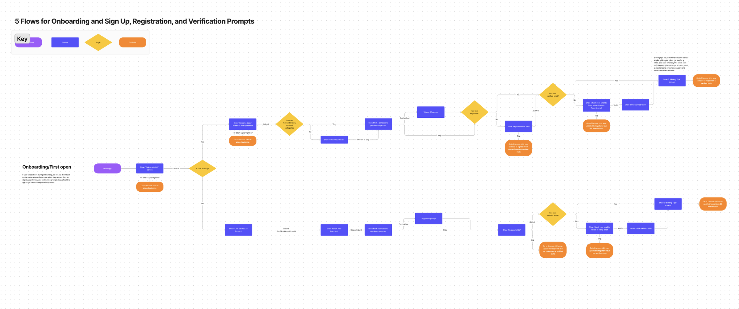
Flow diagram showing all possible logic for an onboarding experience.
Remove-from-bag interaction example from Stackd.
When developers have builds ready, I join the QA testing effort to make sure that both functionality and visual designs match the approved comps. If technical issues arise that keep designs from going live as originally envisioned, I work together with devs to find a solution that we can all get behind.
While this is not exactly my favorite part of the process, it is rather revealing of any shortcomings of the design or communication between teams and is critical to the success of the project.
QA Testing
Having learned a ton about the product space during this round of design and development, the team usually has ideas for new features and optimizations that could be added. For longer term projects, I’ve joined other department heads in brainstorming and fleshing out these ideas so they can be pitched to clients for upcoming scopes.
Future Strategy

Illustration to pitch easier customization.

Illustration to pitch an onboarding tour.
I love learning new things. If there’s a key method you think is missing, I’m game to add it to my toolbox and adapt to how your team works. Iteration is the name of the game after all!